Startup Designing Indian Language Fonts for Apple, Google & 300 Others Makes $2 Million/Year
Recognising the linguistic diversity of India, with its multitude of languages and over 11 official writing systems, Satya Rajpurohit started the Indian Type Foundry (ITF) in Ahmedabad to create high-quality Indian fonts.
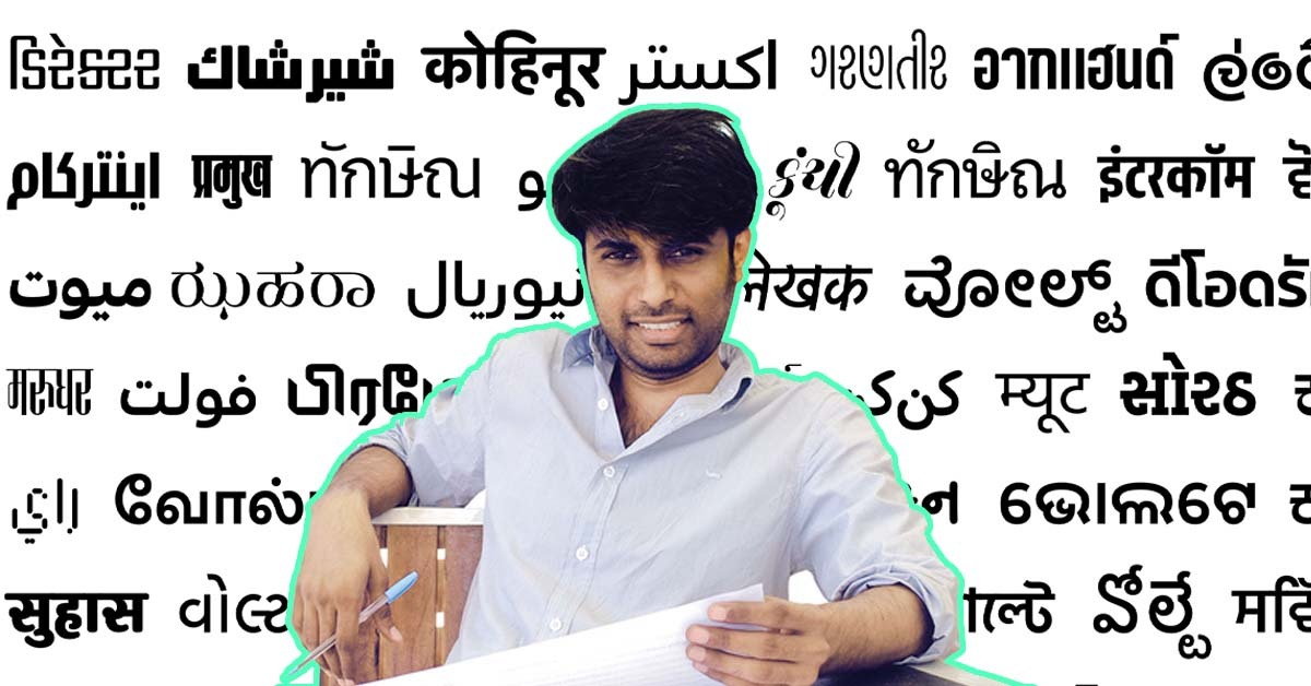
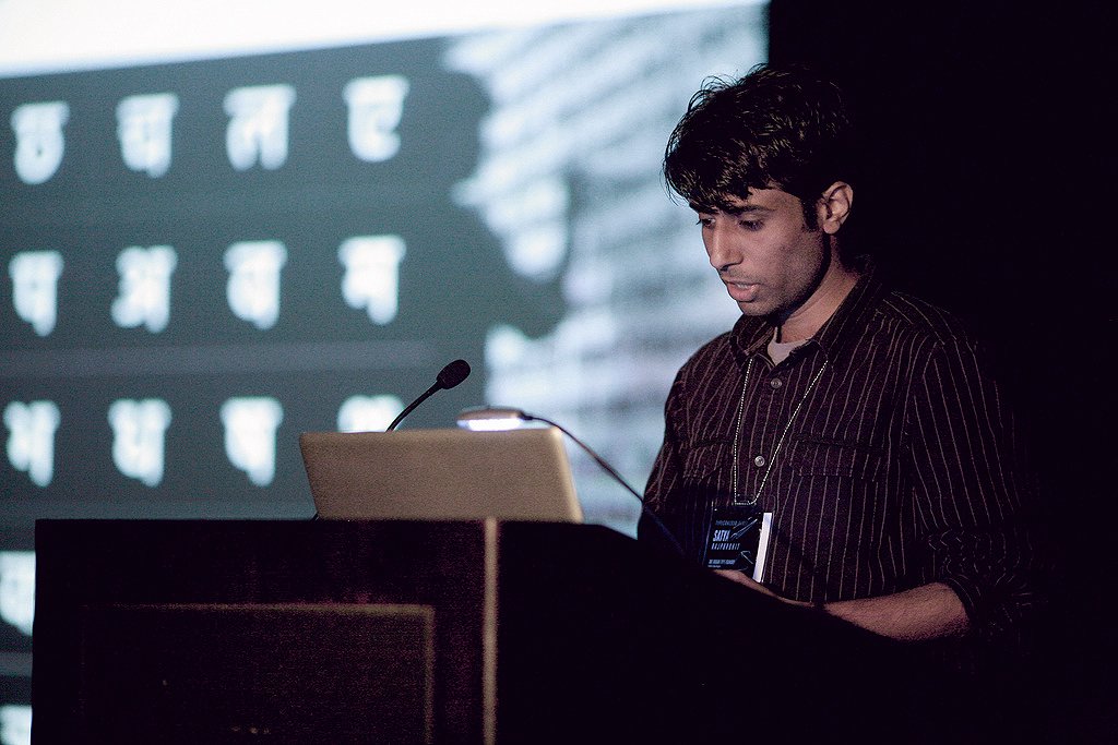
When he was doing the lettering for the projects of classmates in boarding school in Rajasthan, Satya Rajpurohit had no inkling that this skill would lead him to head a design firm that has developed 450 font families for 20 writing systems in the world.
“I enjoyed the creative process but did not yet understand that this was a fundamental aspect of type design. Later, I became fascinated with radium number plates for cars and bikes, which led me to experiment with custom letter shapes. I’d offer this service to my friends and family for free just so I could see my lettering being used. This was my unintended first step into public typography,” says the unassuming 40-year-old.
Satya co-founded Indian Type Foundry (ITF) in 2009 in Ahmedabad.
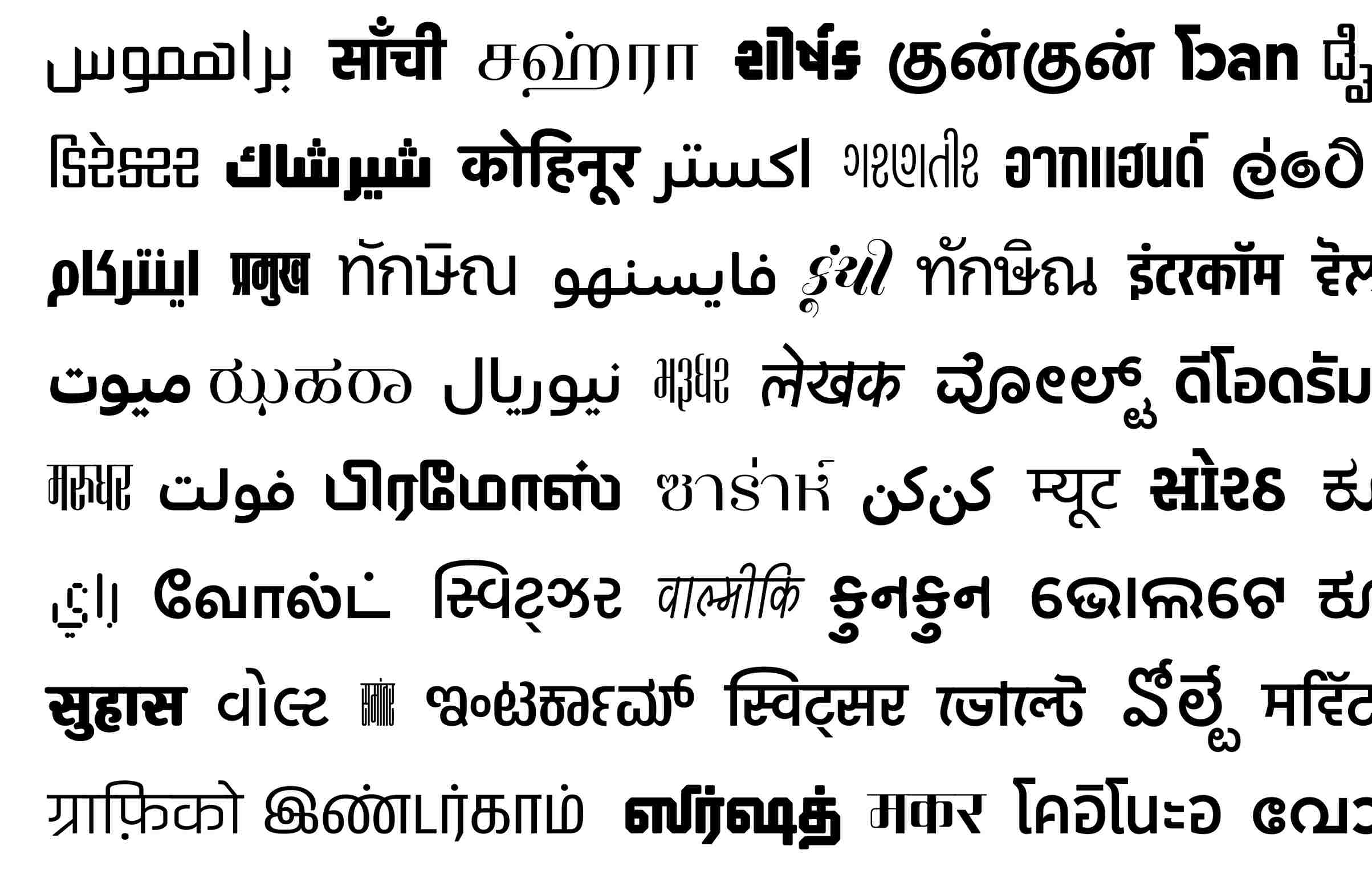
“We started ITF with just one font family (Fedra Hindi). Since then, we have produced over 450 font families, including 300 retail font families available for licensing and around 150 custom and open-source fonts. Some of our most popular fonts are Kohinoor, Volte, Akhand, Poppins, Satoshi, General Sans, Swatzer, Teko, and Hind,” he says.
Transforming typographic landscape with Indian languages
The firm clocks an annual revenue of close to USD 2 million (Rs 16.48 crore approximately) and has around 300 clients from Fortune 500 companies. Among its clients are giants — such as Apple, Google, Samsung, Sony, Amazon, Hyundai, Unilever, Tata Play, Star Sports, SBI, Zee TV, Mahindra, Disney, Kotak, Discovery, and Aaj Tak.
In 2010, Satya received the prestigious ‘SoTA Catalyst Award’ presented by the Society of Typographic Aficionados. He has been featured in Fortune India’s ‘40 Under 40’ list for three consecutive years (2016, 2017 and 2018). In 2017, he was also on GQ India’s ‘50 Most Influential Young Indians’ list.
Today, ITF is recognised as one of the leading type foundries globally, having developed fonts for non-Indian languages — including Thai, Cyrillic (Russian), Greek, Hebrew, Sinhalese and Korean.
However, what makes ITF special is its focus on Indian languages.
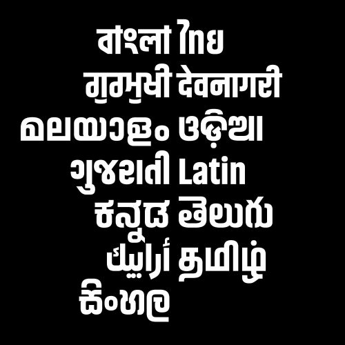
“Our mission was to create a comprehensive collection of premium fonts for Indian languages, driven by a desire for cultural preservation, innovation, and addressing the needs of India’s diverse linguistic heritage,” says Satya.
The setting up of ITF was the result of a collaboration with a Dutch typographer, Peter Bilak.
Peter offered him the chance to design a Devanagari (Hindi) font for his company. “When this font was complete, we searched for foundries that could publish it. However, there were no foundries in India at that time for Indian languages. This realisation prompted us to launch our own foundry with just one font in our library,” he relates.
The company secured Star Plus as one of its first clients, who licensed its first Hindi font.
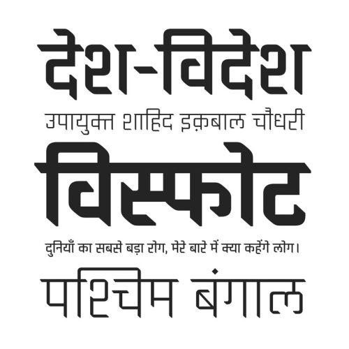
The vast linguistic diversity of India, with over 11 official writing systems and numerous languages, was largely underserved by the global typographic industry. Satya and Bilak noticed the lack of quality and variety in fonts available for Indic languages when compared to the extensive options for Latin scripts.
Creating fonts for Indian languages is more challenging than doing so for world languages, says Satya, because Indian languages, unlike Latin, are complex to draw and have larger character sets that require several months, and sometimes even years, to design.
Additionally, it’s hard to find seasoned designers who are comfortable with both the language and the type design. The ‘matras’ in Indian languages add to the complexity.
‘I cannot imagine a single day not thinking about fonts’
Satya’s parents wanted him to become a doctor; so he spent two years in Kota but failed to clear the exams. That’s when he decided to pursue his interest in art instead. He joined Chandigarh College of Fine Arts, and while studying there, he learned about the National Institute of Design (NID), Ahmedabad. He then secured admission to the prestigious design institute.
“The two years at Kota were the worst of my life. I was not a good student at school except in art. Even if I had cleared the medical exams and become a doctor, I would have been a terrible doctor because it was not something I wanted to be,” says Satya with a rueful smile.
At NID, he got interested in motion graphics, one application of which is creating titles and credits for films. However, here serendipity played a key role. He “stumbled upon an unexpected opportunity” in his third year — an internship in type design at Linotype, the pioneer in making high-quality typefaces.
“That experience was transformative. In those three months, I delved into the world of typography, gaining an understanding of its significance and intricacies. The experience ignited my passion for type design and reshaped my career trajectory,” explains Satya.
His internships at Linotype in Germany and Dalton Maag in the UK were pivotal in preparing him to set up his own venture. They taught him the crucial blend of precision and creativity needed in type design.
“I cannot imagine a single day not thinking about fonts. A font is a collection of letters, numbers and symbols, all dressed up in a certain style. When I design fonts, it’s like I’m designing outfits for words so they can express different emotions and ideas,” shares Satya.
Fonts have long-term value. For instance, Helvetica was first published in 1957, yet this font remains relevant even today. ITF develops both traditional fonts (used for text in books and newspapers) and experimental or display fonts.
Traditional fonts, such as Times New Roman and Arial, prioritise readability and versatility. In contrast, experimental fonts go beyond functionality and embrace innovative shapes, concepts and designs. These fonts prioritise artistic expression and invigorate visual design. They have a lot of character and are used in headlines, logos and posters. For sports events, children’s books, and film posters, ‘grunge’ (messy text) is used at times, he explains.
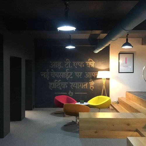
The company’s most popular font is the Kohinoor series designed by Satya. “Before Kohinoor, there was no font that could support all Indian languages. For instance, in an airport in Gujarat, we need signage in three languages — English, Hindi, and Gujarati. Fonts in a family are aesthetically consistent. Apple has licensed the Kohinoor family. If you get a message in Hindi or Gujarati from an Apple device, the font will be from our Kohinoor series,” says Satya.
Incidentally, the Kohinoor font family is on display permanently in London’s The Design Museum.
The inspirations and innovations driving ITF
One of the biggest challenges ITF faced was the scarcity of skilled type designers in India. Students and interns were trained and added to the team. Today. the team of 25 members are spread across the globe.
Another significant hurdle was cultivating a market for fonts. More people, including students, are now willing to invest in quality fonts, recognising their impact on the effectiveness of communication and branding.
The prices of ITF fonts range from just Rs 2,500 for a one-user desktop licence to several lakhs a year for a large enterprise licence.
“At ITF, we offer free licences to students and teachers, aiming to support education and nurture the next generation of designers. In 2021, we launched ‘Fontshare’, providing 25% of our retail font library for free, to make high-quality fonts accessible to everyone. Fontstore was envisaged as a marketplace but currently, we sell only our own fonts. Quality and royalty are two issues that come up if we sell fonts developed by others,” he explains.
Apart from developing fronts from scratch, ITF also acquires fonts. Recently, it has acquired several independent foundries. “We’re on the cusp of launching a new umbrella-type foundry that will unite all our brands. Our goal is to expand our retail library. A key focus for us is ensuring our library is inclusive, representing not just English or Indian languages but also those that are endangered and less represented worldwide.
Talking about his inspirations in the sphere of typography, Satya names Adrian Frutiger — the Swiss type designer known for his clarity and functionality in fonts like Univers and Frutiger — and Herb Lubalin — a creative typographer who infused letters with emotion and narrative. Eric Gill’s harmonious blend of classic and modern styles, evident in typefaces like Gill Sans and Perpetua, has also guided his approach to design.
These pioneers have shaped his understanding of how type can communicate beyond words, blending artistry with utility, says Satya.
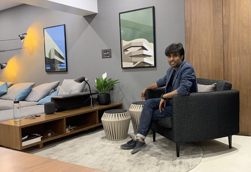
Satya is the eldest among three brothers and one sister. His parents have settled down in Jodhpur. He is happy that his successful venture has enabled him to pay off a significant debt for his father and support his sister’s pursuit of a design career. Currently single, he has been living in Ahmedabad since 2004 when he joined NID.
He enjoys classical, Sufi, and Rajasthani folk music. While he used to play sports in school, today he occasionally finds time for video games. He likes watching movies, mostly Bollywood dramas and comedies. He prefers low-budget films, which do not feature big stars — a recent favourite is ‘12th Fail’.
Regarding work-life balance, Satya says, “Running my own business affords me the flexibility to work on my own terms. Also, I find immense joy in what I do, which blurs the lines between work and leisure for me.” If you found our stories insightful, informative, or even just enjoyable, we invite you to consider making a voluntary payment to support the work we do at The Better India. Your contribution helps us continue producing quality content that educates, inspires, and drives positive change. Choose one of the payment options below for your contribution- By paying for the stories you value, you directly contribute to sustaining our efforts focused on making a difference in the world. Together, let’s ensure that impactful stories continue to be told and shared, enriching lives and communities alike. Thank you for your support. Here are some frequently asked questions you might find helpful to know why you are contributing?

Edited by Pranita Bhat
This story made me
- 97
- 121
- 89
- 167
